The Los Angeles Clippers are embracing their maritime roots with a rebrand timed to the team’s move into Inglewood’s Intuit Dome.
In a new logo unveiled Monday, a navy blue ship with basketball lines etched into its hull sits inside of a C-shaped compass. The team name, meanwhile, stretches around the circumference in a custom typeface once again inspired by nautical elements.
Yes, the Clippers derive their name from fast-moving sailboats popularized in the mid-1800s, which were common in the San Diego area where the franchise played from 1978 to 1984. But don’t feel bad if you didn’t know that.
“Even these people who have been fans of this team forever couldn’t tell you [the meaning behind the Clippers name],” team president of business operations Gillian Zucker said during a video interview last week.
In some ways, the name is now more fitting than ever. A 1970 expansion team, the franchise is no longer young, but recently it has charted a new direction for itself. Long a league bottom dweller, with a wordmark once considered a mere replication of the Lakers’, the Clippers have actually won more games than every team except for the Warriors and Celtics since billionaire Steve Ballmer bought them for $2 billion in 2014, according to StatMuse.
“This is a team that knows where it’s going,” Zucker said. “This is a team that has a purpose and we want that to come through.”
The redesign process started in earnest roughly three years ago, around the time Los Angeles broke ground on the soon-to-open Intuit Dome. Fan feedback regularly highlighted a desire to revive past Clippers elements, like script lettering and the red and powder blue colors which were minimized in the team’s 2015 redesign in favor of geometric components. Then there was the issue of the name—should the team change it?
“People who had any real connection to the Clippers would tell you they did not want to change the name—No how, no way, do not touch it,” Zucker said. “Don’t even think about it. Like even thinking about it is a dagger to my heart.”
After following the franchise through dark stretches, fans were “violently opposed” to the notion of adopting a completely new identity, Zucker said. So executives didn’t even consider alternatives.
“In the process, there’s always this battle between evolution and revolution,” she said. “You can kind of have both if you really get it right, which is, ‘How do you evolve at the same time as create something that feels new and fresh?’ That was the sweet spot we were looking for.”
The new Clippers jerseys will likely feel familiar to fans. The script is back, though updated in a nod toward maritime fonts. Red also returns as a third jersey base color with nautical flags down the sides. Powder blue backers will have to adjust to the pacific blue shade the team has also added to its repertoire.
The team went about testing fan reactions to various color combinations as subtly as they could, mixing new options into surveys and giveaways. It hopes the specific shades of deep blue and bright red will help it stand out from organizations with similar combinations.
The goal, Zucker said, is to elicit two reactions to the redesigned jerseys, with diehards recognizing hints of the past while others are also excited by what’s different now.
Alternate logos include a shortened “Clips” option, as well as an LA abbreviation, with the A sitting atop the L. The compass C element of the team’s main logo has also been pulled out as a standalone design option.
“We did think about our hats,” Zucker said. “We have 50 million visitors who come to Los Angeles every year and we want them leaving with this LA hat.”
The Clippers brought in design agency Doubleday & Cartwright for assistance on the project, as well as sports designer Matthew Wolff, whose portfolio includes work with Paris Saint-Germain and the Minnesota Twins. Nike and the NBA also contributed input—the league, for instance, pushed for the inclusion of basketball iconography in the team’s new logo.
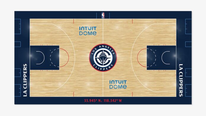
With all the change coming to the franchise, the Clippers aimed for simplicity for their new hardwood, with navy blue around the edges of the court and throughout the free throw lanes, augmented with white and red touches. The new logo dominates center court (and yes, the top of the embedded logo, which neatly sits below the ‘n’ in Los Angeles, will actually face due north in the team’s new digs).
Other related motifs are expected throughout the new arena, which is slated to open in August.
“Now that people know what a Clipper is and that we’ve got this kind of nautical theme that’s going on, how do we integrate that into [the arena] without overkill?,” Zucker said. “We don’t want to beat people over the head with it.”
Intangible nicknames are not uncommon in the NBA—what is a Trail Blazer, or a Pacer, or a Maverick, really?—but the Clippers are ready to have something they can latch onto. More than the literal pieces, Clippers brass plan to highlight the metaphorical aspects of a new brand identity centered around a hard-changing vessel finally facing the right direction. When talking about the Intuit Dome, Ballmer has regularly stressed the active role he wants supporters to play alongside team members on the court.
“I believe that that has informed our mark as well,” Zucker said. “All of it is about feeding into this mantra of: This is what it means to be a part of this organization, and that you’re going to find a sense of community here that’s quite unlike anything else.”

